


.
TIPOLOGÍA | RESTAURACIÓN
LOCALIZACIÓN | AV. ARAGÓN, VALENCIA
FECHA | 2020
SUPERFICIE | 260 m2
CLIENTE | PAFFUTO PIZZERÍA
FOTOGRAFÍA | Germán Cabo
“Nunca te fíes de un chef italiano delgado” es el título del libro escrito por Massimo Bottura, un referente en la gastronomía de vanguardia italiana de alto nivel. Es a partir de esta cita donde empieza el proyecto de branding e interiorismo de Paffuto, un restaurante de alta cocina italiana en Valencia.
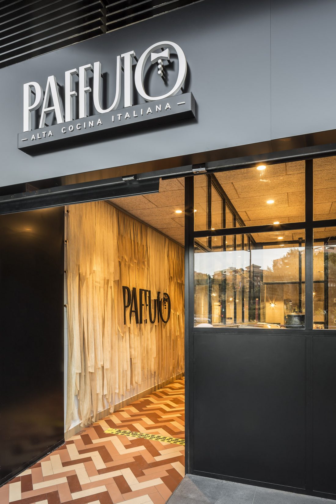
La marca se construye a partir del naming y su significado: Paffuto es un adjetivo italiano que significa, literalmente, “regordete”. Para dar vida a este concepto utilizamos la “O”, dotándola de especial importancia y convirtiéndola en el carácter protagonista de la historia. Para compensar el peso de esta figura, utilizamos una tipografía esbelta y modulada en el resto del naming. De esta forma, construimos una marca con carácter pero amable, características que se trasladan también al proyecto de interiorismo.
La zona del acceso se encuentra presidida por una cocina de horno de piedra acristalada, desde la cual se puede ver a los cocineros del restaurante realizar las pizzas de forma artesanal. La carpintería metálica negra de la fachada contrasta con la tonalidad cálida del pasillo, vestido en uno de sus paramentos verticales con cientos de cintas de tela que hacen referencia a la pasta fresca hecha a mano.
Al entrar, una barra porcelánica revestida verticalmente con madera de pino barnizado y una frase iluminada –ciao amore– nos dan la bienvenida al local.
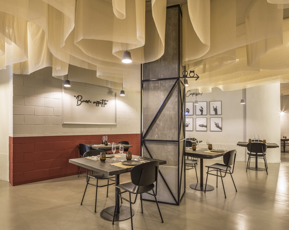
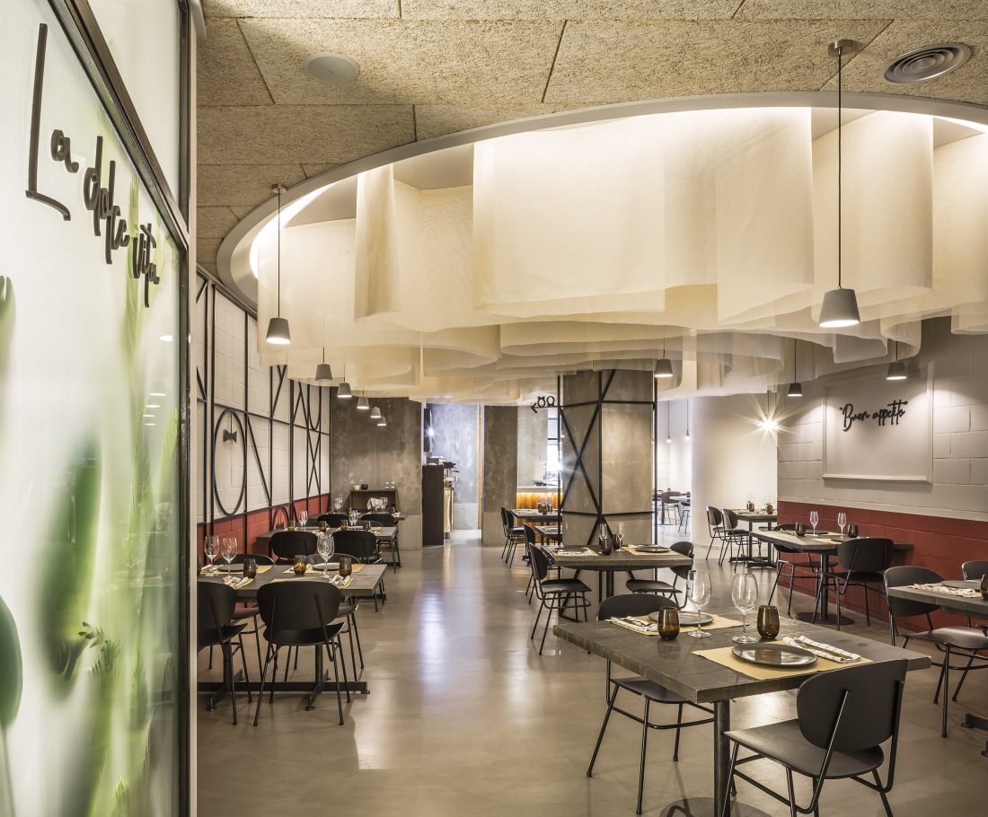
En la sala principal del restaurante, un detalle circular en las molduras del techo es el que funciona de perímetro a un juego de telas que, siguiendo la misma estrategia que la pared del acceso, nos recuerda a las láminas de lasaña colgadas para su secado. En la pared, una gran celosía metálica utiliza las formas geométricas del logotipo y dota de personalidad al espacio.
Frases y dichos italianos, un jardín interior, e incluso un diccionario de gestos son algunos de los elementos que nos encontramos a lo largo de todo el restaurante, todos ellos dentro de una gama cromática sobria y elegante a la vez que actual. Mantelería, cubertería y vajillas están pensadas para que la comida sea la protagonista de la mesa.
En definitiva, un concepto de restaurante italiano que reinventa la estética, desde la marca hasta el interiorismo, aportando una visión rejuvenecida y acorde con los nuevos hábitos del consumidor.
EN:
‘Never trust a thin Italian chef’ is the title of the book written by Massimo Bottura, a benchmark in high-level avant-garde Italian gastronomy. It is from this quote that the branding and interior design project for Paffuto, an Italian haute cuisine restaurant in Valencia, begins.
The brand is built from the naming and its meaning: Paffuto is an Italian adjective that literally means ‘plump’. To bring this concept to life, we used the ‘O’, giving it special importance and making it the main character of the story. To compensate for the weight of this figure, we used a slender and modulated typography in the rest of the naming. In this way, we built a brand with character but friendly, characteristics that are also transferred to the interior design project.
The entrance area is dominated by a glazed stone oven kitchen, from which you can see the restaurant’s chefs making the pizzas in a traditional way. The black metalwork of the façade contrasts with the warm tones of the corridor, which is dressed on one of its vertical walls with hundreds of fabric ribbons that refer to handmade fresh pasta.
On entering, a porcelain bar clad vertically with varnished pine wood and an illuminated phrase -ciao amore- welcome us to the premises.
In the main room of the restaurant, a circular detail in the ceiling mouldings acts as a perimeter to a set of fabrics that, following the same strategy as the entrance wall, reminds us of the sheets of lasagne hung to dry. On the wall, a large metal lattice uses the geometric shapes of the logo and gives personality to the space.
Italian phrases and sayings, an interior garden and even a dictionary of gestures are some of the elements found throughout the restaurant, all within a sober and elegant yet modern chromatic range. Table linen, cutlery and crockery are designed so that the food is the star of the table.
In short, an Italian restaurant concept that reinvents the aesthetics, from the brand to the interior design, providing a rejuvenated vision in line with new consumer habits.
.
COMERCIAL